OUR HUMBLE BLUE (OR SOMETHING PRETTY CLOSE): PANTONE'S 2010 COLOR OF THE YEAR
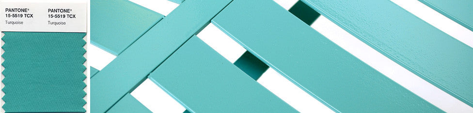
Sure, they're a year late but still we're flattered. Pantone has finally gotten wise to the cool heat of our standard blue powder coat color, or their best approximation of it, naming it their color of the year for 2010. In their words it combines "the serene qualities of blue and the invigorating aspects of green, [evoking] thoughts of soothing, tropical waters and a languorous, effective escape from the everyday troubles of the world, while at the same time restoring our sense of wellbeing." Yikes! All that new-agey, soothing, invigorating languor is making us a bit queasy (read the rest of their blathering press release at this link). Write whatever nonsense you will (even if it really has nothing to do with us)—the color is still beautiful. Give us a ring if you want a sample chip.